Crunching the Numbers
Step 4: Plotting the Results
Hopefully, you’ve managed to stay with us to this point. Every possible scenario has been evaluated and had its Impact/Probability score assigned. Now it’s time to assign each crisis a spot on a grid.
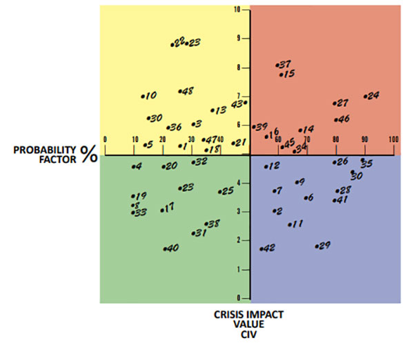
As you can see, the grid has a vertical scale that shows the Impact Value (0 to 10) and a horizontal scale that represents the Probability (0 to 100%). A 6/72 would appear in the red quadrant. A 4/40 would go in the green.

Every event will end up plotted into one of the four quarters on the grid: Red, Yellow, Blue and Green according to their Probability and Impact. The Red Zone is the upper right quadrant, the Yellow Zone is the upper left quadrant, the Blue Zone goes on the lower right quadrant and the Green Zone goes on the lower left.
Plot all your events according to the crisis impact data (Impact/Probability) on the grid and when you’re all done, it should look something like this:

Now that you have them all plotted, you can rank them from the event that has the highest Impact and highest Probability (those in the Red Range) to scenarios that rank low in Impact and low in Probability (the Green Range).
Remember, you want to focus on events in the Red Range first, then the Yellow.
Based on the sample plotting above, here are the Red Range events that require near-term attention:
RED RANGE (High Impact/High Probability)
| Crisis # | Crisis Description | Impact/Probability | ||
| 24 | Reorganization | 7.0/90 | ||
| 14 | Data Breach | 5.8/68 | ||
| 27 | Layoffs | 6.8/79 | ||
| 37 | Sale of Company | 8.2/60 | ||
| 46 | Unfavorable Media Story | 6.4/80 | ||
| 34 | Robbery | 5.2/66 | ||
| 45 | Unsubstantiated Media Story | 5.2/61 | ||
| 16 | Embezzlement/Fraud | 5.6/56 | ||
| 15 | Data Failure | 7.8/62 | ||
| 29 | Senior Partner/Board Scandal | 6.0/52 |
Your goal is to reduce the Impact or the Probability of each scored event so that you can move them into the Blue or Green Range.
Let’s look at data failure for starters. How would you reduce the Impact or Probability of a data failure?
To reduce the Probability, you could make sure all your data is backed up regularly. This would move the crisis to the Yellow Range because it would be less likely that data would be lost if there were a hardware failure. That’s a good start, but you’re still going to have to address the Yellow Range threats somewhere down the road. It would be far wiser to move them straight to Blue or Green. For example, you can choose to back up the data on a schedule and store a backup of it off-site somewhere or put in in the cloud. No matter what the crisis, you’ll always have a backed up copy of your important data.
Layoffs or reorganizations are part of the business cycle. They can even be considered inevitable. While you may not be able to execute a no-layoff policy to reduce the Probability, you can reduce the Impact by devising an internal communication plan that keeps employees informed, handles staff reductions or reorganizations with honesty, integrity and transparency, and creates a system for reducing staff with dignity.
Table of Contents
1. Introduction
2. Why You Need to Plan Now!
3. The Four Stages of a Crisis
4. Assessing Impacts
5. Assessing Probabilities
6. Putting It All Together
7. Plotting the Results
8. Rinse & Repeat
9. Developing an Effective Plan
10. Plan Components
11. Crisis Response Modules
12. Decision Trees
13. Resuming Operations
14. Summary
15. Templates & Resources
